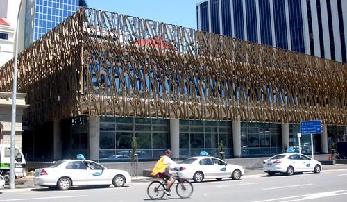
Look closely at the picture above. What do you think? What kind of building do you think it is?Take a few moments to guess..........
Right. Now, would you believe me if I tell you that the building is The New Supreme Court Complex in Wellington, New Zealand? Yup, that's the new building which was officially opened on 18th January 2010 (just few days ago) by HRH Prince William.
From my humble view, I would say it's an interesting design but......(I'm not going to tell the rest here).
"Breathtaking inside," he says.
The outside?
"No, the inside."
What about the outside?
"Well, art is in the eye of the beholder," says Mr Key. "Look, it's okay, but I prefer the inside. (www.3news.co.nz)
Yes, the inside of this building is better but I can't find any photos in GOOGLE to paste them here. huhu. I saw the inside of this building from TV3 news (oh ye kat sini pun ada TV1, TV2 and TV3) when it was officialy opened by Prince William. When I googled about the news, they published more photos of Prince William than the building itself!
Opppss, I think I better paste some explanation about the design here to make us understand more why did the architects; Warren and Mahoney came out with the design.

The rich cultural history of New Zealand and its natural beauty were the inspiration for the new Supreme Court building, which was designed by architects Warren and Mahoney.
At the centre of the building is the courtroom. It is designed to be visible from the street, symbolising the idea of transparent and open justice. Its exterior is made from copper and the interior features panels of silver beech, which together form a diamond pattern that was inspired by the kauri cone.
A bronze screen envelops the exterior of the new building. The forms were inspired by the intertwining of rata and pohutukawa trees. Red cut glass is set behind the bronze, representing the berries and flowers of both trees.
(www.justice.govt.nz)
Now we've understand what's the inspirations behind the design. This is a building that used about $80.7 million and it's going to stay for another 100 years. Kiwis can have their say about the building but it's not going to change the fact that it is their New Supreme Court. I guess this is what happen with the modern art design compared to the classical design. Hmmmmm...........

11 comments:
hmm.. unik, but mcm xsiap je! hihi..maybe nk buat konsep mcm sarangburung stadium kat beijing tu.. tp ni boxy sket.
that's what most kiwis said; "it looks unfinished". ntahla kenapa diaorg buat desgn mcm tu. mmg boxy sket.
Salam Ziarah, Kak Nuradyani;-)
Saya suka tengok bangunan itu, unik. Teringat satu kata2 hikmah (erm iklan bank kot..)
"Kamu mungkin melihat semangkuk nasi, tapi kami melihat ada 234 gram beras dan 1234 biji nasi" (nombor2 hanya rekaan, tapi begitulah bunyinya lebih kurang..)
Kaitannya dengan bangunan ini, kita mungkin melihat ia sebagai 'tidak siap', tapi mungkin mereka yang membuatnya 'melihat' yang lain;-)
it looks like a building cladded by many many huge paperclips...hihihi..atleast its better then a building in melbourne uni looking like cow patch.
Ustaz,
itulah this art may looks beautiful to others.
Mama Miya,
Have u written anything abt the building in melbourne uni? I would like to see it too.
it looks weird but unique..i thought its a prison!
seriously.. macam bangunan tak siap.. memang xde bumbung ke?
macam bangunan tak siap. hihi..
i agree with syigim, 1st look ingatkan x siap agi! lahh... rupenye memang macam tu. :)
ada org kiwi komen "Looks like scaffolding"
Post a Comment